Sunday, 22 December 2013

Final Images of Anthony's Hand Cast.

i have used varous tools, layers, and filters to create these images.

after i made and finished the cast i made of Anthony's hand. i then decided to develop the images on photoshop. for this image i just used the colour replacement tool which worked as a quick edit but it doesnt live up to the standard of my other work. i chose green simply because it is Anthony's favourite colour.
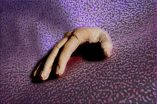
when i came to edit this image i decided to crop it down so that my own hand was no longer in the image but the shadow remained. i think this worked really well. i then played around with the curves on photoshop this created the tones and depth in the colours i then altered the hue and saturation to make the hand green and the backgound a deep purple. the texture within the background is caused by the material i placed under the cast before photographing it in the studio.


this image is another one where I just used the colour replacement tool. i chose to use red in this image because it symbolises love and i love Anthony. this image really worked well considering how simple the effect was. i didnt want to over complecate the image by adding too many effects to it as the contents of the image displays a powerful message within its own right. by adding more layers and effects to it it would take away from the effect and mood that is has originally.
when it came to editing this photograph i decided to experement with layers as well as the curves, hue and saturation, colour balance and levels to create this effect. i think it has worked really well the background worked really well i am happy with the fact i managed to get such a wide range of colours within the background without it taking away from the cast itself. the only part of this image i'm not totally happy with is the shadow underneath the hand as it looks like its been crudely edited. i didnt really have much control over this given the types of layers and features i used on the image.


again with this image i changed the hue and saturation and colour balance i think this has worked really well with the yellow contrasting with the blues and yellows it has worked well but its nothing amazing its of an altight standard i have gone onto producing better pieces than this one but its better than my frist colour replacement cast image so i'm happy enough with the result.


With editing this photograph i used the spot healing tool to remove any noticable holes left from the casting process and proceeded to alter the curves i then decided to add a filter onto the image. i then removed the area of the hand because the effect didnt look right over the top of the hand cast. i think this image works really well the only thing i would have changed is the colour of the effect.
For this image i simply adjusted the curves to create this effect i also filled in any noticeable holes with the spot healing tool. this edit is very simple but i think it is the most effective of the images i have done so far. i really love the background i didnt expect the background to turn out so good.


After i got my graphics tablet i decided to create another edit from the photographs of the hand cast. for this i altered the colour balance to make the whole image blue. i then created a new layer and decided to draw the outline of the hand cast onto a new layer. I did this fairly rough to begin with. once i got the outline of the hand drawn out i touched the drawing up by removing excess lines. once that was done i created another layer and used the paint tool on a higher opacity to paint in the finger nails i chose yellow because it is opposite blue on the colour wheel meaning they contrast against eachother these colours work well on this image because the amount of yellow used is so small and the blue still domonates. I then created another layer to add the shaddows i chose red with a opacity set much lower to help blend the colour into the blue. this worked out really well.
before i flattened the image i decided to copy the layer with the outline of the cast on so i could develop this into another piece.


i took the outline i created from the prevous image and duplicated it over and over moving and re arranging the image each time untill i filled the square completely. the reason why i made this into a square is so i could then create a repeated pattern from the image. i did this in the exact same way as i created the Rammstein logo for the background of the pop art image i have done previously of Anthony. once i defined the pattern i then created an A4 document and filled the page with the pattern as shown below.




Making and development of Anthony's hand cast. ( and health and safety)


Anthony was so amazing and let me create a cast of his hand so that i could photograph it
i started by asking him to cover his hand in Vaseline to prevent the modroc from taking his skin off. i then prepeared the modroc. i did this by cutting strips of mod roc off and put them into a pile. i then got a container of warm water and made sure that Anthony was sitting comfortably and had a drink at hand. i then proceeded to place the modroc into the water ringing the excess water off the piece of mod roc and then placed the modroc onto anthony's hand i repeated the process untill his hand was covered on one side. i then alternated the direction in which i placed the modrock onto his hand. i did this 4 times on the hand. i made sure to ask him how he was feeling if the modroc was huring him or anthing luckily he was fine. i then did the same process on the other side of his hand. once the modroc had time to dry out slighly i then removed each half from his hand. once his hand was free i helped him to clean his rings and before i put the mold together and covered all the gaps and holes with modroc.

once the mold was completed i left if for a couple of days before i mixed the plaster with a 2;1 ratio of plaster to water and poored it into the mold. when the plaster was set a couple of days later i soaked the whole thing in water to remove the modroc to reveal the cast. all i needed to do once i got the cast out from the modroc was clean it and wait for it to dry fully before filing it down and adding filler to the incomplete areas. 


Other health and safety issues i had to deal with throughout this project are as follows: 

  • taking care not to spend too long at the computer. 
  • making sure that i have good posture when working at the computer.
  • insuring that i take regular breaks from looking at the computer screen. 
  •  when taking photographs out and about to be aware of what is around us. 
  • take care when taking pictures to insure that very little people are in the background. 
  • make sure that the lighting is set right to avoid migraines. 


Tuesday, 17 December 2013

Photoshop drawings.


The original drawings to this are in my Scrapbook.

To create these images I started off by drawing a section of a photograph I have of Anthony. I then scanned the drawings into the computer before developing the images in Photoshop.


I started to develop this image by duplicating the scanned image to form a top layer so when I added the layers of paint I wouldn’t lose the detail. I just changed the layer type of the duplicated layer to multiply. I then switched to the original image and began to add paint using the brush tool. Before I added paint I changed the opacity of the brush down to create a semi-translucent colour. I then began to paint in the image starting with the shadows. The only thing with this method is you have to paint everything you want in that particular colour in one go because the second I let go of the mouse it fixed the layer of colour. This effect can work well but it takes some time and patience to master the tool. I found it this method of painting an image tricky when using a mouse or track-pad that is why the image has clear lines where I clicked off the mouse. I was lucky enough that my dad bought me a graphics tablet for Christmas and I was able to attempt this form of painting again with better results as I will go onto shortly. After I built up the various layers of paint for this image I just added the final layer (the multiplied background layer) to the top of the layer order this brought back the fine detail which I covered up during the painting process. I chose to use unrealistic colours for this to experiment with the tool. I then went onto create a more realistic version of the same image as shown below this was done in exactly the same way only I chose different colours.  


i used a similar method to create these images. i chose to add the colour of anthony's eyes into the drawing. i think that this worked out really well. so i decided to develop it another step.


i took the actual eye of my edited drawing and used the clone stamp tool to reproduce the image in this way. ( the clone stamp tool is difficult to explain how it works without being shown)
here is a link that shows how to use the tool.

http://www.youtube.com/watch?v=Np1GgwmuHxc


The following images I used using my graphics tablet which allowed me to create a far better outcome from my scanned in drawings.
Created on Christmas Day

As you can see there is a huge difference in quality of the painting after I’ve used my graphics tablet I was able to achieve this because my graphics tablet allows me to move around my image freely and without removing my pen from the tablet resulting in a smoother finish and join of colours. I chose to use browns within this image so it would be a nice comparison with my previous edits. I chose to use purples in the hair because it complemented the slight hints of red within the browns that I used. Overall I am happy with the outcome of these images the method and techniques used are remarkable in comparison with my previous images without using the tablet.


Created on Christmas Day
For this image I chose to use blues purples to create a different mood within the drawing. I think it has worked really well and I am happy with the outcome there are some areas within the image that I could have tried to make smoother but overall I think this image was a success. I also added a mixture of colours within the hair to create an added interest to the painting. This turned out rather well I like the hints of yellow and green within the hair it adds depth to the painting which it needed.


For my last image done this way I decided to use totally different colours than I have in my other edits. (Leaving green and purple behind slightly) I used yellows and reds to create the main section of the painting I think this change in colours has worked well and created a much warmer image than I have managed to achieve in previous edits. I couldn’t quite pull myself away from adding purple and green into the image but I made sure that the main colour in the hair is blue with only small hints of green and purple which work well with the image as a whole. 


Magazine Covers.

From all the various photo edits i've created i have chosen some of them to be developed into possible magazine covers. here are the ones i have done.


I decided to develop my Celtic cross edited image even more by creating various magazine covers. This was fairly simple thing to do. I just opened the image into Photoshop duplicated the background image and removed the background of the edited image by using the polygonal lasso tool. I also decided to remove a small section of his hair to make his hair flow better within the image. This also gave the image a more professional appearance. The next thing I did was open another image I had of Anthony, where he shone his lazar pen into the camera. I decided to change the hue and saturation of the image to make the light from the lazar pen more vibrant. When I was happy with the result I then transferred the image into what would become the magazine cover. I then re-arranged the layer order so that the image of Anthony with the lazar pen became the background. This image needed re-sizing I did this by using the ctrl+T to bring up the guides so that I could alter the size of the image.  Having looked at the composition of the image as it was at that point I knew it needed another element to make the magazine cover stand out. I decided to add the Celtic cross into the background to tie it in with Anthony’s face. I did this by opening the image and transferring it into the magazine cover document. I then needed to change the layer type to multiply to make the background of the Celtic cross disappear. All I needed to do then was resize the Celtic cross image I did this in the same way as I did the background image. Once I was happy with the layout of the main magazine cover all I needed to do was add the finishing features such as the bar-code and masthead. This was done by adding a random barcode image from Google. (Just for demonstrational purposes) the header needed a bit more thought and time to create. To create the mast head I simply added a new text layer and typed his name into the box and changed the font as you would in any other program. The only difference is I downloaded more fonts from a website. The reason for finding other fonts is they make the magazine cover more professional looking and aesthetically pleasing. I then changed the colour of the text to yellow because it is a colour that complements the red of the lazar pen light and it stands out and makes the magazine cover visible from a distance. Once I was happy with the overall design of the magazine cover I then saved it and created alternative covers.


With this magazine cover I decided to use the same initial image of Anthony’s face and change the background and text. For the background of this image I used a photograph that I took while at a gig the other year. I just altered the hue and saturation before positioning the image as the background. I like the image because it has the lighting on it which helps to make the magazine cover look more professional. I chose to use red text on this image because it complements the colours within the image of Anthony and it also balances out the yellow within the background image. The only thing I didn’t add to this image is the barcode because I didn’t notice it that is the only alteration I would make to this image. I chose a different font for this masthead to give the magazine a different feel and to appeal to a slightly different audience. However I think that the previous font works better than this font.  
With this magazine cover all I did was changed the background cover to a different image from a gig I went to. I chose this image because it contained colours that I haven’t worked with in my magazine covers as of yet. I think that the blue colour within the image help to make the brown of Anthony’s eyes stand out as well as bringing out the brightness of his lips. I decided to stick with the original font and colour for the masthead. I also chose to change alter the opacity of the masthead to bring back some of the detail within the Celtic cross which I added back into the design as the background image was relatively simple. I think that this worked out really well and there isn’t anything I would change to make the image any better.
This image is fairly similar to my original magazine cover in terms of colours and positioning of the images. The only thing I have changed is the background image to an image I took from when I saw a band live. I decided to keep the colours the same as the original magazine cover because of how pleased I was with the way that they worked with this image of Anthony
These are my other magazine covers that I edited in a similar way to this but the only difference is I used a different image and edited the original image in a totally different way by using multiple layers and later types to create the image I also changed the hue and saturation and colour balance to get his hair so bright green. 

To create this magazine cover I simply took the original image and duplicated it onto a new layer and removed the background. I then used the gradient tool to create a new background on a fresh layer. I then went back onto the face and changed the colour levels to add more shadows into his face. I then used the colour replacement tool using pale skin toned colours I went over the image to create the image seen. To create it into a magazine cover I just added a simple but effective masthead I added texture to the mast head by double clicking on the text layer and altering the effects that came up. I finally added the barcode to the image and the magazine cover was completed. I think this is one of my better magazine covers as t isn’t over complicated and it captures Anthony’s mood nicely within the photograph.

Saturday, 14 December 2013

building up layers and changing layer effects also adding filters.

 I took this image and created several images from it. i did this by using several layers and effects.


I have created these images by using various layers and filters within Photoshop. Here is the original image so you can see the development i have made.  

I started to develop the original image by duplicating the image. The main reason for duplicating the original image is if I don’t like the look of a particular effect I can easily delete the layer and start again. On the duplicated layer I changed the type of layer to luminosity. This effect looked awesome in the background but I wasn’t happy with the way his face looked. The next thing I did was duplicate the background layer again and changed the layer type from normal to multiply. I then used the polygonal lasso tool on a feather of 3px to cut out the background of the layer so I could delete the background revealing the background with the luminosity layer type behind. I then decided to add on a filter to create texture on Anthony’s face. I did this by going into filter and selecting artistic. I then sifted through the options when the box came up until I found the effect I wanted to use in this case it was the brush strokes and I selected angled brush option. Because I set the layer to multiply it allowed me to see the detail of the original image through the filter adding texture to his face and nothing else. I think this image was a great start into exploring what different effects I can use on Photoshop to develop my images. After seeing how well this came out I have decided to develop the same image again using different layer types and filters.


I started editing this image by duplicating the original image as before; I then changed the duplicated image to overlay in the layer types. I then duplicated the background layer again and changed the layer type to colour burn. These effects over the top of each other made Anthony’s skin appear flawless and pale. I rather liked this effect. I then decided to try blurring the background to add some detail to the image and draw the eye to Anthony’s face and not what’s going on in the background. I think this worked but having looked at it once the image is completed I have noticed that I have lost some important detail within Anthony’s face. In particular his eyes seem to look washed out which is something I could have avoided and will take more care on future images to avoid this. Overall I think that the background worked out better than the main focus of the image but I have learned from my mistakes and I know where I went wrong  and how I can improve on my next image. The only thing I am happy about on his face is the slight hint of colour in his hair and the smoothness of his skin which did work out as I intended it to. Given the time I spent on this edit I am rather disappointed in the outcome. 


I decided to take a break from editing the same image and turned my attention to this image. I am rather happy with this outcome considering it took me a lot less time to complete than some of my other images. I started to edit this image in the same way as my other ones by duplicating the background layer before adding an effect to it and chopping at it with the polygonal lasso tool. The effects I used on the first layer of this image was hard mix this made his face white with the pink and blue areas you can see on the image. However it lost the rest of his body. So I duplicated the background again but this time I changed the layer type to linear dodge this made brought back the body. I then went back to the first layer and deleted the background and the body with the polygonal lasso tool leaving just the face on this layer revealing the body under it. I then duplicated another background later and added a filter to it this time I chose the stained glass effect this created the effect that can be seen in the background. When I was happy with the result I flattened the image and saved it. Overall considering the short time it took to create the final outcome is rather good. 


Reverting back to this image again, I started to edit this in much the same way as the others by duplicating the background layer etcetera. On this image I took more time and care in what layer types I selected. I also added more layers than I have done in any of my images previously. I started off by adding the overlay layer type to get the basic smooth skin effect then I added another duplicated background layer and selected the lighter layer type. This smoothed the skin even more but made his eyes too light so I simply erased them from that layer to reveal the slightly darker eyes underneath I think this made his eyes stand out and look amazing. The next layer I added I decided to focus on the hair. To get his hair to have the blue tint that I have managed I chose the vivid light layer type this gave his hair the colour tones that the final image has. All I needed to do next was cut out his face and the background so that his hair would remain blue/red. I did this by again using the polygonal lasso tool with a feather 3px which softens the edges and makes it blend into the background better. The only thing left to turn my attention to was the background. This time I wanted to keep some of the detail within the background so that the main focus would be on the face and not an over complicated background. To create the background I simply duplicated the background image one last time and selected the exclusion layer type. I then added a filter onto this. The filter I added was the neon glow I simply changed the colour of the glow to purple. I chose purple because it is a colour that complements the blue and red tones within his hair without blending into them. If I’d have used another colour it would have drawn too much attention to the background and take away from the main subject matter of the image which is something I didn’t want to do. The final thing I did was re arrange the layers to insure that the background layer was at the back of all the other layers. When I was happy with the order of the layers I flattened the image and saved as a high quality jpeg.   


This image took me a rather long time to complete. I took inspiration from an image I saw in my book ‘gothic art’ in it I saw the work of Melanie Delon on one of her images she has managed to overlay the Celtic cross on top of a face. I knew that Anthony likes the Celtic cross designs so I chose to give it a go. I started this edit by opening the edited image above and I decided to work on top of that image. I just duplicated the image and altered the hue and saturation until the hair colour was darker. I then altered the colour balance because the hue and saturation couldn’t quite get the image the way I wanted it to. Once I had the face the way I wanted it to look like I took an image from Google of a Celtic cross (if I was to do this effect again I would draw my own design out and scan it in but given it was my first attempt and I didn’t know how it would turn out I didn’t want to waste my time on something that may or may not work out). I opened the image and copied it as a new layer. I removed the background of the image by changing the layer type to multiply this automatically removed the white background of the Celtic cross and made Anthony’s face visible within the gaps. All I needed to do from there is re position the image to where I wanted it to be. This was done by using the move tool. I needed to rescale the image this is done by using crtl +T this brought up the guides that allowed me to re size the image. Once I was happy with the size of the Celtic cross I pressed enter to alter the image. The next thing I needed to do was remove the areas of cross that covered the eyes and mouth and hair this was simply done by using the eraser tool. I then needed to fade the image out a bit so it blended in with the skin layer underneath. This was done by altering the opacity of the Celtic cross layer this was easy to so as it is just a slider bar that I needed to move. Once I was happy with the opacity of the cross image I then turned my attention to the background for this I created a blank layer and added the background this was done by using the gradient tool I just selected the colours that I wanted and dragged the tool from the top corner to half way into the image and the tool filled the background in from there. All I needed to do was delete the background from every layer I had open by this point the layer count was something like 17 given all the amount once I removed the background from all the layers I simply made sure the gradient background layer was at the back of the image before I flattened the image and saved. Having spent considerable amount of time on this image I am more than pleased with the outcome of this edit. It may not look exactly like Melanie’s image but I still think it looks rather good. The only thing I would change is I would take more care when cutting out the images on each layer to create smoother outlines. I also would draw my own cross design if I had more time to complete pieces but as my first attempt at this particular method of photo-manipulation I couldn’t have wanted it to turn out any better. 


For the next development of this image see my post of magazine covers.


Contacting Artist Via Deviantart.

here are the links to the images i like and have attempted to contact the artist asking them relevant questions.
I did contact the artists below but some of the comments have been deleted not by me.
http://www.deviantart.com/art/IMVU-PanicRomantic-419816929

http://www.deviantart.com/art/Untitled-419805878 i didnt find the response that helpful within my project but i do like the effect however i tried to find the effect on photoshop and i didnt know where about in the program it was so i moved on to develop another image and not waste my time when theres so many other options i can go into.

http://www.deviantart.com/art/Silence-419110893 <---- with this one i saw it and it inspired me to create a magazine cover from a similar image i have of Anthony.

http://studpuffin.deviantart.com/art/Tough-Gal-419801981 I found this short conversation helpful as I tried to add in some of the effects he has used into my own work.

This is the result I got after I added the same layer onto a photograph of Anthony. 


After I added the effect onto the image I decided to erase the effect from the background I did this to make the effect more noticeable. I also added another filter to the background to give the image an alternative feel. 


Photography Research and Development of Photoshop.


Facts about the history and development of Photoshop


· The product of two brothers.

· Thomas and John Knoll.

· Their father was into photography.

· Their father has his own personal darkroom in the basement

· Their father also had an interest in early computers.

· Thomas experimented with photography.

· John meddled with his dad's Apple II computer.

· Their dad bought one of the first Macs on the market in 1984.

· The brothers were astonished by its capabilities but it was the inadequacies that lead to the idea to develop Photoshop.

· John Knoll worked at Industrial Light and Magic - Lucasfilm's nascent special effects division, founded for Star Wars.

· Thomas was studying for his Ph.D. on image processing at the University of Michigan

· Thomas just bought a brand-new Apple Mac Plus he was shocked to find it couldn't display greyscale images on the monochrome monitor.

· Thomas then decided to write a code that would do the job that he wanted.

· John was also working on image processing at ILM

· When the brothers met up over a holiday, they realised that their work was similar and both were impressed with each other’s findings.

· They began to collaborate on a larger application.

· John had bought a new colour Macintosh II and persuaded Thomas to rewrite Display to work in colour

· The more that john worked with his display the more features were needed such as gamma correction, loading and saving other file formats.

· Despite his brothers wishes distracting him from his own work, Thomas was more than happy to create these features.

· Thomas also developed a method of selecting and affecting a selected part of the image. he also image-processing routines and a feature for adjusting tones (levels)

· Controls for balance, hue and saturation were then developed.

· The above features later became the defining features of Photoshop.

· By1988 the display had become ImagePro and was adequately advanced. John thought they might have a chance at selling it as a commercial application.

· Thomas was still working on his Ph.D. when the brothers decided to take the newly developed prototype to the mass market, Thomas was reluctant at first, it wasn’t until john made it clear to him the extent of the gap within the market that Thomas agreed to the demanding work that was needed to produce a workable and profitable product.

· They decided to look for investors. This process wasn’t easy to begin with as with any other newly developed product. This process was made harder with the brothers in agreement on the programs name.

· Nobody is totally sure where the name Photoshop came from somebody sujested the name and it stuck.

· most software companies dismissed Photoshop as they were developing a similar product of their own.

· It was only adobe that showed immense interest in the program and was willing to take the program on. But this wasn’t as straight forward as it seems. Eventually a scanner manufacturer called Barneyscan decided to bundle it with its scanners.

· This wasn’t a long term deal so john soon returned to adobe to get the ball rolling into a more permanent deal.

· John met met Russell Brown who was the Art Director. Russell was highly impressed with the program and persuaded the Adobe to take it on.

· Photoshop was not sold wholesale but only licensed and distributed, with royalties still going to the Knolls.

· Thomas continued developing all the main application code.

· John contributed plug-ins separately.

· Photoshop launched in February 1990.

· When photoshop launched it cost less than $1000.

· The brothers started to work on version 2 shortly after the first version was launched.

· Adobe added more coding staff Mark Hamburg was employed to help with this.

· New features shish as Bézier paths, Pen tool, Duotones, import and rasterisation of Illustrator files, support for CMYK colour.

· These additions meant the program could be used for professional printers, insuring a stable share within this rather new market.

· The program's first Product Manager was Steven Guttman.

· Steven Guttman started giving code names to beta versions this idea continues to this day.

· 'Fast Eddy' - version 2 - was launched a year later.

· In 1993 adobe developed the program on the windows platform.

· Version 3 included 16-bit file support and most importantly the introduction of layers.

· Version 4 was similar to version 3 but only added adjustment layers and actions to the program.

· Version 5 added a colour management feature and the History palette feature which with its extra 'nonlinear history' behaviour created a wide range of possibilities for users. Also version 5 included Editable type and the Magnetic Lasso features.

· The following features have been added since then up until last year :


Version 5.5 :

· Bundled with ImageReady

· Save for Web

· Extract

Version 6:
Vector Shapes
Updated User Interface
"Liquify" filter
Layer styles/Blending Options dialog

Version 7
Made text fully vector
Healing Brush
New painting engine

Version CS (8

· Camera RAW 2.x

· Highly modified "Slice Tool"

· Shadow/Highlight command

· Match Color command

· Lens Blur filter

· Smart Guides

· Real-Time Histogram

· Detection and refusal to print scanned images of various banknotes[5]

· Macrovision copy protection based on Safecast DRM technology

· Scripting support for JavaScript and other languages

· Hierarchical layer groups

· 16 bit per channel layers, painting, and adjustments

· Support for files over 2 Gigabytes

· Documents up to 300,000 pixels in either dimension

· Type on a path

Version CS2

· Camera RAW 3.x

· Smart Objects

· Image Warp

· Spot healing brush

· Red-Eye tool

· Lens Correction filter

· Smart Sharpen

· Vanishing Point

· Better memory management on 64-bit PowerPC G5 Macintosh machines running Mac OS X 10.4

· High dynamic range imaging (HDRI) support (32 bit per channel floating point)

· More smudging options, such as "Scattering"

· Modified layer selection, such as ability to select more than one layer.

Version CS3

· Native support for the Intel-based Macintosh platform and improved support for Windows Vista

· Revised user interface

· Feature additions to Adobe Camera RAW

· Quick Select tool

· Alterations to Curves, Vanishing Point, Channel Mixer, Brightness and Contrast, and the Print dialog

· Black-and-white conversion adjustment

· Auto Align and Auto Blend

· Smart (non-destructive) Filters

· Mobile device graphic optimization

· Improvements to cloning and healing

· More complete 32 bit / HDR support (layers, painting, more filters and adjustments)

· Faster launching

· ImageReady removed

Version CS4

· Smoother panning and zooming and fluid canvas rotation

· OpenGL display acceleration in Photoshop

· Native support for 64-bit on Windows Vista x64

· Adjustments panel

· Masks panel

· Improved Adobe Photoshop Lightroom workflow

· Content-aware scaling

· Extended depth of field

· Auto-blending of images

· Auto-alignment of layers

· New file display options (tabbed document display and n-up views)

· New file management and workspaces with Adobe Bridge CS4

Version CS5 (the version i’m using currently)

· Content Aware Fill

· Puppet Warp Tool

· 64 bit for Mac OS X

· Bristle Tips

· Mixer Brush

· Automatic Lens Correction

· Easier HDR toning for beginners

· Improved selection and masking controls

· Camera RAW grain control

· New Blend modes: Subtract and Divide

· GPU HUD controls for brush resize, color picker, color sampling

· Improved Ray Tracing quality and speed (Extended)

· Repousse 3D extrusion tool (Extended)


· Image based lights (Extended)

Peer Review.

Peer review!!!
Right I am glad you have a blog with all your stuff on but you need to identify that in your book that you have it all on a blog. Maybe you could do a collage off his likes and dislikes and thinks that Anthony loves instead of constantly taking images of him and editing them. You could try creating an image or Anthony with a load of little images of him and his favourite things. Star evaluation and don’t forget your artist researchJ.
Samantha Gilligan
Ok love the blog but the pic with all the add signs what does that sign stand for? Better to explain.
Magazine cover looks ace I love the red background one.
You need to copy the link in ur book to ur blog aswell as ay that u have a blog in your book and what your blog is about. You ould do a collage of Anthony in the centre and all the things he likes around him.
On ur simple edits explain what areas u edited and what u did to edit them.
Artists research is required on artists using Photoshop u might see some edits u like and would use in ur work.
Well i can honestly say i am sick of seeing Anthony’s face but your work is pretty good, i like the pop art stuff, but yeah needs research and annotating and stuff only a bit of time left on this project

Your blog looks really good from what I have seen so far. You’ve suited your specialist field because you’ve done so many different types of photography photo edits using photo shop. I really like the pop art work you’ve produced. Only improvements I suggest is that you do your artist research get more work into your sketchbook as it’s quite empty. You could print of a print screen of the different images you have edited, put them into your sketchbook and write about them... differences, similarities &what you’ve done. Research into your special field, do your annotations/explaining your work and maybe with the info you have collected about Anthony, think of what you could do with this just as an extra. As an idea, you could put images of his likes/dislikes into a background of an image of him using photo shop to show you developing your ideas. Great work so far, but just keep going and going and do as much as you can for what the brief specifies as we don’t have long left!     – Lauren ;) 

Thursday, 12 December 2013

Implementation Basic Photoshop Air brushing.

I'm going to edit this photograph using Photoshop. Here is a step by step process of how I've edited this image. 

The first thing I did is alter the image levels. This is done by clicking in image then adjustments and selecting levels. This produces a box with sliders.


I moved the sliders to alter the light levels 
and shadows. This makes the image clearer 
and cleaner.


Once I was happy with the levels I then took my attention to the image its self. I decided to remove the spots and ‘imperfections’ to create a professional finish. 

To remove all the spots and imperfections I first started by using the spot healing tool. This tool removes spots, moles and any other imperfections. 


Once I removed the imperfections I then lightened the eyes by using the dodge tool. This tool slightly lightens the surface. The tool is perfect for eyes and teeth.


The previous steps are the steps I use on all my images, the only variations are some times I may leave some imperfections in such as moles this depends on the image that I'm using. After this initial stage I can then start to use a variety of tools and editing techniques.
Final Image.

Tuesday, 10 December 2013

Artist to look into for this photoshop project.

these are the artists that use photoshop. from my book.

ANNE STOKES .information about Anne stokes. I have followed the basic method that Anne uses to create her images on top of one of my photographs of Anthony the finished outcome isn’t quite how I wanted it to look but I had spent enough time on it and decided not to develop it any more than I did. Here is the edited image. 

The next step I would do if I had more time to complete this image fully would be; to keep building layers of skin tones and add more detail into the eyes until I would be able to remove all the black outlines. I think the overall outcome of this is good and is of a similar standard to my other work however it had the potential to be developed into a higher standard image. I would have liked to have completed this image by the above method also I would have added a background to it done with a similar technique. I quite like the overall effect I was able to achieve if I had my graphics tablet sooner in the project I would have had more time to develop this technique. I have used my graphics tablet because it can achieve more precise and finer detailed results that I am unable to do with a mouse or track-pad on my laptop. 

MELANIE DELON   melanie's website. Having looked at Melanie's work I decided to try my hand at adding the Celtic cross onto Anthony's face. This works well because Anthony likes the Celtic crosses. This image took me a rather long time to complete but I am more than happy with the result. I will go into more detail on how the image was created in another post.


CRIS ORTEGA -http://www.crisortega.com/
ELENA DUDINA- http://www.elenadudina.com/
JOANA SHINO http://shinobinaku.deviantart.com/
MARCUS JONES http://www.screamingdemons.co.uk

Monday, 9 December 2013

Exploring the Colour Replacement Tool on Photoshop.

The main reason why I have chosen to use green in so many of my images is because Anthony's favourite colour is green. When I asked him why his favourite colour is green the only reason he could think of was 'because it is' so I then asked him why he likes the camouflage print. Again his reply was simple 'because it’s green'. At that point I gave up asking him to justify the reasoning why he likes the things he does.


With these images i have used the same tool for all of the images but changed the colour and added different steps to make the images more interesting.
I used the colour replacement tool this allows me to choose any colour and paint a transparent layer of colour over the image. For this image I chose a fairly dark green. the reasoning behind choosing a darker colour is to do with the original image being a bright image allowing me to get away with adding a darker colour on top of the image without making the image look dirty. simple image has turned out rather well and i am pleased with the outcome however it is a very simple technique and i will use this image within other more complex pieces.

unlike the image above this started off as a much darker image therefore limiting me to the colours i could add to it. after some contemplation i decided to go with the brightest green i could make. this made the lighter areas on the image stand out more and making the darker sections stand out also. overall this image worked out but i could have chosen a different image as this image is too dark for the effect to work out with amazing results.
i really like this image mainly because the green used is bright yet it doesnt take away any of the detail or emotion within the image. this is the last simple monotone image i created from here on i started to be more creative with the colour replacement tool to create more interesting images with different moods. 


with this image i decided to use the rectangular marquee tool to select the small areas i then copied and pasted each section onto a different layer before adding the colour using the colour replacement tool to add the colour to the image. i repeated the process changing the colour each time to create the final image. once all the sections were complete i then flattened the image in order to save the image as a high quality jpeg.
For this image I decided to incorporate Anthony’s favourite pattern (camouflage) into the image. The first thing I did was run a quick Google search on images of the camouflage print to get an idea of the shapes and colours I would have to re-create. I then opened the original image into Photoshop I chose to use this same image because I was pleased with the way the colour replacement tool worked on the previous image. To create the camouflaged effect image I started by using the polygonal lasso tool. This tool allows me to select the precise area that I want to be selected. Once I had selected the area I wanted to, I then copied and pasted the section onto a new layer. I then selected an appropriate colour that is representative of the camouflage print. Then I used the colour replacement tool to paint over the section. I then repeated the process changing the colour each time. Having completed the image I have noticed that the blue colour doesn’t quite fit in with the camouflage effect if I was to re create the same effect I would take more care choosing the colours. Overall I think that this image had turned out well given that it was my first attempt at creating the camouflage effect on top of an image of Anthony. 


This image is one of the first images I edited in this way, looking back on it I can see how crude the cutting out of Anthony’s face is. The reason why it is so sharp is I simply didn’t feather the cutting tool this made the image look like this. Considering it was an early edit it wasn’t too I.

I started this edit off by cutting out the face and hair and duplicating it into a new layer. I then chose my favourite colour (purple) I then used the colour replacement tool to add the purple onto the face. However the purple I used was a darker purple which has ended up in detail being lost from his face. This section of the image didn’t work out quite the way I intended despite this I really like the background. To create the effect I made sure I was on the background layer. I then used the smudge tool and set the brush at a medium setting and dragged the image slowly in the same direction. Once I was happy with the smudge effect I then added the colour replacement tool on top. This time I chose a bright green this complements the purple really well also as I mentioned before it is also Anthony’s favourite colour. 


For my next image I decided to incorporate the logo of Anthony’s favourite band into the image.

 I started by selecting the image and adding the colour replacement tool onto the image. Again I chose green. I then added the logo onto the image in a different layer I just removed the background from the image. From there i copied and pasted the logo and moved the image around until I was happy with the position of the logos before flattening the image. I chose not to change the colour of the logos because I didn’t want to over complicate the image by adding too many different colours to the image which would result in an unprofessional looking image. 


With the following images I used a different method to achieve a similar result. Instead of using the replacement tool I decided to adjust the hue and saturation. Then I altered the colour balance. This created a similar effect.

I think this image is one of my weaker images. I don't think this effect works well on this image at all. I’m not quite exactly sure to why it doesn't work but I know it’s not as high quality as my other edits. If I’m being honest I made it purple because I love purple and it didn't work at all but at least I know not to go over the top with the colour. The image below has worked so much better than this one and i am really pleased with the result of it in comparison to this image. The image i used had more variant in colours to begin with which helped to make the edited image such a success. 

Adjusting the image my using this method allows me to easily control the areas of the image I want to be in a particular colour. However this method has its drawbacks, it won’t let me have the exact colours that I want. for example if I wanted a yellow face and a green jacket it wouldn’t let me cause when I change the jacket colour to green it automatically changed the face colour to purple. It has worked out on this image and made the image stand out almost like the pop art style images I started off by doing. I really like the way that this image as turned out i particularly like the fact it includes both mine and Anthony's Favorite colours. and I love the expression on his face.